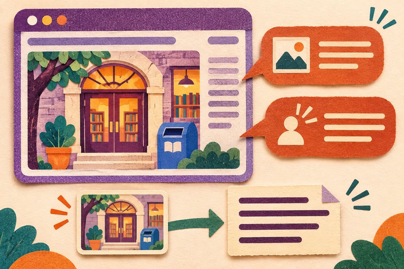
A photograph can be described accurately and still have the wrong alternative text for the page where it appears. An editor might list the colour of a doorway while leaving out the feature a visitor needs to recognise. An icon might receive a detailed shape description while its action remains unclear. The useful starting question is what the image contributes here.
W3C's Web Accessibility Initiative provides guidance for making that decision. This article applies its image tutorials to an original, fictional library website. The examples are editorial exercises, not results from testing a real library service or a certification that a site meets every accessibility requirement. The aim is a repeatable review of meaning, function and surrounding content before an image is published.
Start with the page task
Before drafting a description, write a short statement of the reader's task. On an imagined library visit page, the reader may be trying to identify the correct entrance. On a news page, the same building photograph might illustrate a renovation story. On a catalogue link, an image could act as the route to another page. The file has not changed, but its job has.
WAI's informative-images guidance says the alternative should convey the relevant information or meaning, rather than automatically describing every visible detail. It also makes the author responsible for deciding whether an image is informative or decorative in context. That decision requires reading the page, not only opening the media file.
For the fictional visit page, note which facts already appear in ordinary text. If a paragraph identifies the entrance but the photograph adds a recognisable blue return slot beside it, that relationship may be useful. If the image merely adds atmosphere and contains no needed information beyond the text, the decision may be different. Do not choose a category only from how attractive or expensive the picture looks.
Use the decision tree as a question sequence
The WAI alt decision tree asks about text in the image, use in a control, information contributed and decorative purpose. It does not cover every possible case. Its value is directing attention to the page context before choosing an alternative, rather than providing one stock sentence for every picture.
Apply those questions to one placement at a time. Ask whether the image contains words the reader must obtain, whether selecting it does something, and whether nearby text already carries its useful meaning. Record a reason for your choice. A note saying decorative because all practical information is already provided is easier to review than a bare blank field.
In a shared editorial task, the person uploading an image may not know why it was selected. Include a sentence about its purpose with the handoff. That can prevent a technically valid but unhelpful description from being copied across several pages whose readers need different things. This is a suggested working practice, not an additional requirement imposed by the decision tree.
Make an informative description specific enough
Imagine the library photograph shows a side entrance beside a blue return slot. A candidate alternative for a visit guide could be: Side entrance beside the blue book-return slot. That phrase conveys the identifying relationship rather than listing every window, paving stone and cloud. It remains a fictional example, not directions to an actual building.
Now change the editorial purpose. Suppose a design article examines the arrangement of windows and a projecting roof. The first description may no longer provide the information that article needs. Review what the visible comparison is meant to demonstrate and what the surrounding explanation already says. Reusing the old phrase because it was once approved would skip the new judgment.
Keep unsupported conclusions out of the alternative. A photograph of a doorway does not, by itself, establish opening hours, permission to use it or whether every part of a route is accessible. If the page needs those facts, verify and state them through appropriate content. Alternative text should not become a hiding place for claims the image cannot substantiate.
Treat an empty alternative as a deliberate choice
WAI's decorative-images tutorial recommends a null alternative, written alt="", for an image that adds no information in its context. Omitting the attribute is different: some screen readers may announce a filename when it is absent. A decorative image still needs an intentional implementation decision; leaving a field unexplained is not the same as making that decision.
For the fictional library, a soft illustration of stacked books beside a paragraph may contribute atmosphere without supplying another fact or function. If so, a decorative treatment can avoid adding a description that interrupts the useful information. The reasoning depends on that placement. The same illustration used in a lesson about the arrangement of the books would need another assessment.
When a publishing system offers a decorative checkbox, check what it actually saves. A blank-looking editing field does not show whether the final markup contains an empty attribute or lacks one. The editorial decision and its implementation must agree. This article does not claim that every content system treats blank fields identically.
Describe an image control by its purpose
The functional-images tutorial explains that alternatives for images used as controls should convey the action or destination. It also distinguishes an image alone in a link from an image that repeats understandable text within the same link. Review the whole interactive element, rather than assigning the image a label in isolation.
In our fictional catalogue page, a small book illustration is the only content of a link to the catalogue. A candidate name such as Browse the library catalogue communicates the destination more directly than Green book with three pages. That wording is appropriate only if the link really opens the catalogue; an editor should check its actual target rather than infer it from the artwork.
In a second version, the same link already contains the visible words Browse the library catalogue, and the illustration adds no further meaning. Its treatment can avoid repeating that same name. This condition concerns text inside the same link, not a similar sentence somewhere else on the page. Reviewers should not erase an informative name merely because related words appear in a distant heading.
Give complex information room outside the short description
An image containing a route, a schedule or a detailed comparison may need more than one short phrase. WAI's complex-images guidance describes a short identification alongside a longer textual equivalent of the essential information. It offers different ways of associating that explanation with the image, including making the fuller description available in the page.
Suppose the fictional library page contains a diagram of three rooms and their connecting doors. Calling it Library diagram identifies its type but does not supply the relationships. A useful accompanying explanation would describe the relevant arrangement, using confirmed information appropriate to that example. Do not squeeze a whole set of directions into an increasingly long alternative merely to keep the visible page shorter.
For a data chart, preserve the values or relationships that the page relies on, rather than substituting a general compliment such as strong improvement. If you cannot establish the source data or read the labels reliably, that is a content problem to resolve before publishing. A confident-sounding alternative does not repair an uncertain graphic.
Keep important words available as text
WAI's images-of-text guidance generally favours actual styled text over text embedded in an image. It explains the flexibility of real text and says that, where an image of text is used, its alternative must retain the words presented. This is relevant when a useful announcement is uploaded only as a designed poster.
Imagine a fictional library event poster contains a title, time and booking information. The editor should not assume that Event poster supplies those details. Put the necessary information into the page's actual text and review the image in that context. If an image repeats information already available, reconsider redundancy rather than blindly repeating every line in several places.
Take particular care when the poster changes. Updating the visual file while leaving old page text can create two versions of the event. Compare the meaningful content after the change, including names, dates and any action the visitor is expected to take. This is an editorial consistency check; it does not claim that a text alternative alone makes an entire booking journey accessible.
Distinguish the alternative from the caption
A visible caption might identify the photographer, explain the occasion or credit an illustration. An alternative should serve the image's information or function in context. Those jobs can overlap, but they are not automatically identical. Review both before copying a caption into an alternative field simply because the text is already available.
For the invented entrance photograph, a caption could explain that the image accompanies a fictional example. The alternative might identify the doorway's relationship to the return slot. If a provenance note is needed, keep it available in the appropriate visible place. Do not fill a short functional name with production details that obscure the action a reader needs to understand.
The same restraint applies to a generated illustration. Review it for relevant content and unsupported visual claims before writing its alternative. A plausible scene is not evidence that a real building, event or layout exists. Our examples do not use invented imagery as proof of a real library's facilities or visitor arrangements.
Check the saved result in the page
WAI's tips for text alternatives recommend concise wording focused on purpose, putting important information first. They also warn about icons whose visible labels disappear in smaller layouts. A description approved in an editor should therefore be checked in the version readers receive, alongside the surrounding text and controls.
For the fictional catalogue link, review both a wide and a narrow layout. If visible wording changes, check whether the control still has an understandable accessible name. Do not assume a visual change tells you everything about what is exposed to assistive technology. Record the actual version and behaviour examined; a screenshot alone cannot establish the complete accessible name or reading experience.
Use inspection and relevant assistive-technology testing where available, and distinguish these from a quick editorial check. An automated report may help locate a missing attribute; the absence of that error does not demonstrate that the wording communicates the right meaning. Likewise, one successful check does not establish the accessibility of every page, device or interaction on the site.
Finish with a small, reviewable image record
When handing the page to another editor, keep proposed changes separate from completed checks. For example, write that the catalogue destination was confirmed but the narrow-layout name still needs inspection, if that is the real state. Marking the entire item done because someone entered a sentence can hide the remaining implementation work. Conversely, if an illustration is deliberately decorative, retain the reason so the next editor does not add a long description solely to remove an apparently empty field. Clear records protect the intended decision when a page is revised or an asset is reused.
For each placement, save the page, image purpose, proposed alternative, any longer explanation and the reason for a decorative choice where applicable. Add the link destination if the image participates in a control. This gives an editor or developer something concrete to compare with the published result, rather than an instruction to make the image accessible somehow.
In the library exercise, the final decisions differ: the entrance photo conveys a relevant relationship, the atmosphere illustration can be decorative under the stated condition, the image-only catalogue link needs a useful destination name, and the room diagram needs a fuller explanation. These outcomes follow the stated contexts. They are not four strings to paste into unrelated websites.
More practical web-reading guides are available in our Technology section. For image alternatives, the durable habit is to examine the task, decide what the image contributes and verify the saved result in context. Sources consulted 6 November 2026: selected W3C WAI image tutorials. The library, descriptions and editing scenarios are hypothetical; no real user test, whole-site WCAG conformance, legal compliance or search-ranking guarantee is claimed.